Understanding UX for Sports Team Websites

There is no doubt that sports provide us with hours and hours of entertainment. As avid sports fans, we are always hungry to find out all the latest news and events relating to our favorite sports teams and what’s coming up in the season ahead of us. The best way to provide that information is your team’s website.
But posting news and stats alone is not going to get you very far. Your sports team website should, of course, feature the news but it should also encourage your fans to come back to your website, interact with it, and help you spread the word about your team.
The easiest way to do this is to provide a smooth user experience. It will make your website that much more memorable as well as make your fans feel welcome. And when they have no problems using your website and finding relevant information, they’ll be more than happy to get involved in the comments section as well as share your wins with their friends and family.
What is UX ?
User Experience or UX determines how a user will feel when they interact with your website. It’s not about adding a big button above the fold and expecting everyone to click it. A good UX takes into consideration the motion it will take to reach a button, how the button looks, as well as how the button behaves when hovered over and clicked through.
A website that applies the best UX principles will not leave your users frustrated. In fact, it will make your users feel as though every action they made on your website was effortless – from using the navigation to getting to specific pages to reading your latest blog posts to leaving a comment or using the social share buttons.
Moreover, the design elements themselves such as background images, colors, image galleries, and more will not obscure your main content but rather complement it and draw your visitors in.
How to Apply UX Principles to a Sports Team Website
As many other niche websites, sports team sites have design trends of their own to follow. Since building a loyal following and recognizable brand are the emphases, they often have large images and the team’s colors display prominently. Plenty of featured news is also a great way to keep fans engaged. Here are six key elements any successful sports website should have along with tips on how to apply these UX principles.
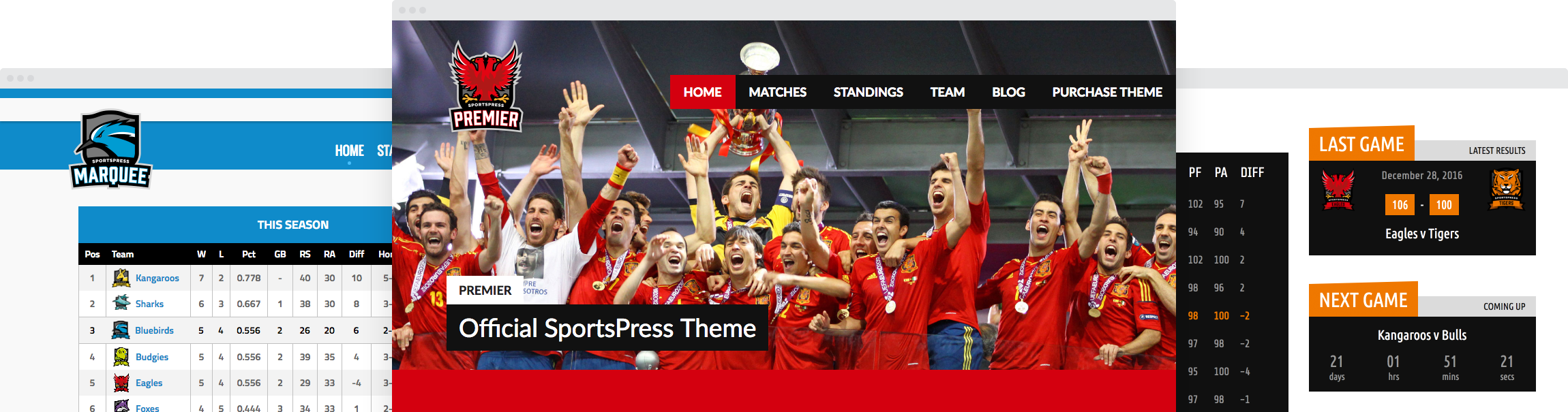
1. Large Photos
Many successful sports website use large photos to showcase their team members and the team’s gameplay highlights. This is often achieved with dedicated sections and pages to display detailed player statistics along with sliders at the top of the page or even in the background. Some of them use the photos as a way to tell the story behind the team or the individual.

A great example of using photos to tell the story is Dwyane Wade’s website. He is a famous NBA star pursuing many different passions. His website uses bold and large photography to showcase his achievements, update his fans, and display every endeavor Dwayne plays a part in. The imagery is a great way to pull your readers in. The navigation menu is hidden away not to obscure the images, yet still easily accessible.
Make sure your images are properly optimized for the web–saved in the .jpg format and with the proper dimensions your theme requires. They should also scale responsively as the size of the screen changes to appear crisp and clear even on smaller devices.
2. Team Colors
Your team colors should be used throughout the site to reinforce brand recognition, however, do make sure to use those colors as accents rather than dominating colors. Using a light background with a dark text or vice versa will ensure readability. You can apply your team colors to navigation menus, calls to action, and headers to bring different sections of your website into focus. Avoid using shadows, gradients, and 3D buttons. Stick to flat colors in your buttons and navigation menus to keep up with today’s preferred aesthetic and to ensure maximum compatibility for the mobile devices your fans are using on a daily basis to view your site.
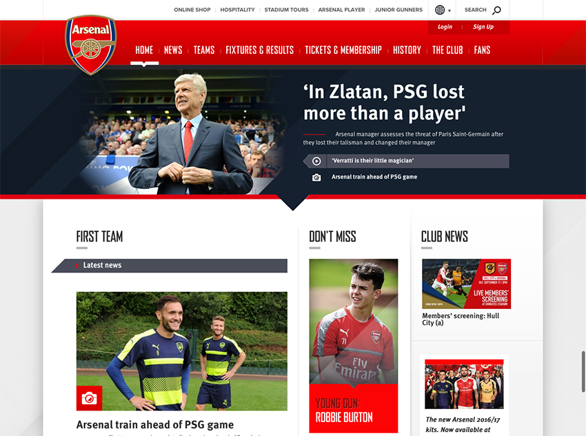
Arsenal’s website uses their club’s colors throughout the website to build brand recognition and to provide a familiar feel to their fans. The most important news are featured immediately at the top with the rest of the latest stories occupying the rest of the website. Navigation menu is clearly laid out and it’s easy to access different parts of the website.
3. Featured Content Area
Featuring the latest news related to your team plays a big part of your website so make sure those sections are clearly marked. Use this space as your call to action so it’s essential your copy is clear and compelling. Use a short sentence or two to summarize the news and provide a link in the form of a button to encourage visitors to read more.
Consider using descriptive text in your links such as “Read More” or “Find out more” instead of “click here” to draw attention quickly and to clearly communicate what will happen when they click on the link. Keep your text styles consistent rather than using numerous styles and colors. Consistent styles will improve readability and do a better job exemplifying your brand.
If you’re using sliders to showcase your featured content, they should also be responsive and have controls that allow your visitors to pause the slideshow. The same principle applies to videos.
Try to keep the featured news section at the top of the page so your fans can get to important information without a need to scroll.
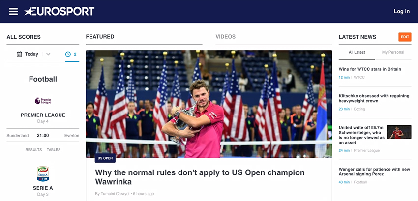
The European sports news website is a great example of how to show a lot of content without making the website feel cluttered. The most important news is featured front and center while the sidebar space is occupied by statistics and latest news.
4. Statistics Section
Successful sports teams websites are not afraid to show off their statistics. They are often displayed as tables so it goes without saying those tables should be responsive so your mobile visitors can view them with ease while on the go. If you are offering your fans a chance to download stats, make sure the download link is marked with clear language like “Download” and consider providing an explanation of what will happen once the link is clicked. Will it open up in a new browser window? Will it automatically download to their device?
5. Social Media and Contact Information
Your social media and contact information should be featured prominently on your website, not only so your fans can follow you and show their support on social media but the media can get in touch with you easily as well. Make your follow buttons and contact info is easy to find. And if you’re not keen on including contact information directly on the site, consider providing a downloadable press or media kit.
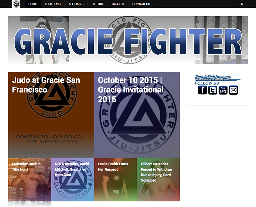
Gracie Fighter uses images to accent its most recent news which use a subtle color overlay from the color palette. Social icons are prominently displayed encouraging visitors to show their support on social media as well.
6. Ensure Your Website Loads Quickly
All of the points mentioned above play an important role in the user experience of your website. However, there is one additional thing to keep in mind: your website’s speed. If your site loads slowly, visitors won’t stick around long enough to keep up with your team, no matter how big of fans they are. Ensuring your website loads fast will cater most to fans visiting from mobile devices where bandwidth is a precious commodity but it applies to anyone who happens across your site. The easiest way to check how fast your website loads is to use a tool such as Pingdom or Google Page Speed Insights.
6 Examples of Successful Sports Websites With Great UX
- Formula 1
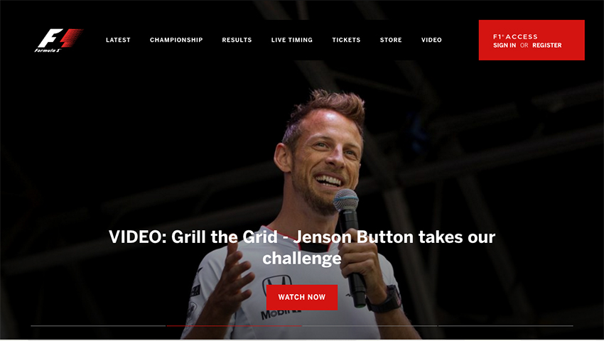
Formula1 makes excellent use of video to intrigue its website visitors and a prominent call to action that begs to be clicked. The navigation menu is clean and easy to navigate.
- Hendrick Motorsports
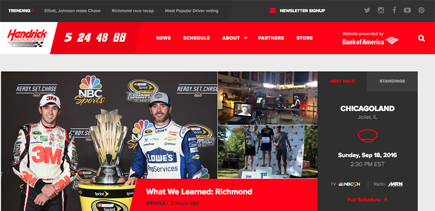
NASCAR’s team, Hendrick Motorsports includes two menu bars at the top which allow their fans to easily access any part of their website. Social media icons are present as well as their biggest sponsor. The time of the next race is shown above the fold along with the rest of the featured news. Their team colors dominate the website.
- Marine Corps Marathon
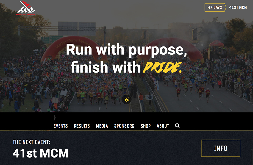
Marine Corps Marathon features their tagline in bold typography on a full-width background image. The space above the fold is clearly dominated by the countdown to the next event. Menu bar has been shifted to the middle of the screen and then stays on top as the visitor scrolls down. Different font for the word Pride and the bold yellow are a great way to put the focus on marine’s greatest traditions.
- Richard Petty Motorsports
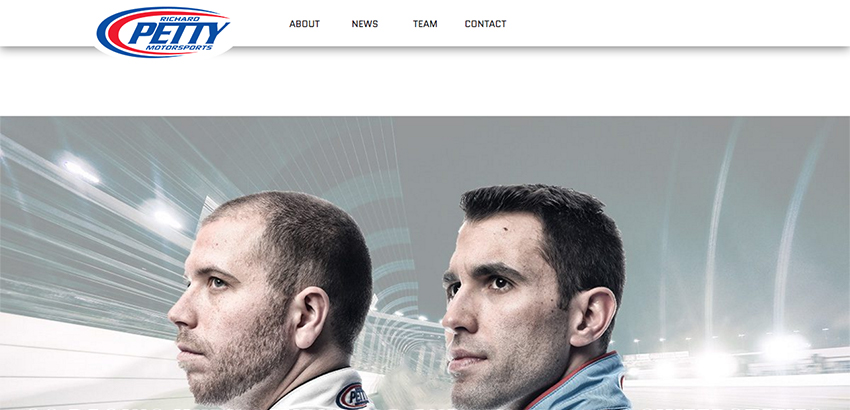
Richard Petty Motorsports opted for a clean and simplistic design that forgoes flashy design elements and instead puts the focus on their latest news, statistics, and information about their next race.
- NBC Olympics
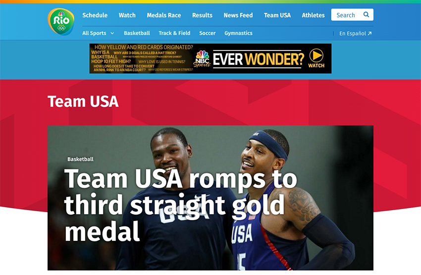
NBC Olympics features all the latest news from the 2016 Rio Olympics. Their website is dominated by bold colors and featured images to create a lively website. Navigation is laid out in two rows and visitors can easily filter through the news to find the ones they are most interested in.
- Rory McIlroy

Professional golfer Rory McIlroy uses large images to tell his story which makes him appear more human and personable. His whole website gives off a friendly feel and makes the visitors feel as though they are visiting his home.
Conclusion
User Experience can be difficult to understand at first. And its key concepts might seem too “over your head” to apply to your website. However, with the tips outlined in this article, you’ll be well on your way to creating a gorgeous website your fans will love to visit over and over again.
By the way, we recently updated all of our themes to provide an even better UX for your sports websites so be sure to download them from your account area. And if you have any questions, don’t hesitate to get in touch.